Showing posts with label paint. Show all posts

Exploring Paint on Fabric

As I was finishing up editing a few sessions late last night in the office I continued to contemplate what kind of fabric I would use for the office curtains.  I looked through a few swatches online and didn't really see anything that stood out to me.  So, I remembered seeing that they had created their own fabric on Young House Love, and I thought maybe that was the route I should go.  However, while I think I could create a nice geometric pattern for a fabric on the computer, I'm not too great at creating anything that had a more organic/watercolor like feel that I was hoping to use for the office curtains.  So, I thought...maybe I could just paint fabric?  I was very ready for bed, but of course when I have an idea I can't just sleep on it...I have to do it.  So, I wanted to at least try it out.  I knew I had picked up a piece of fabric in the scraps bin at Hancock Fabrics a few weeks ago that was a good natural color...sort of canvas-like, and went at it.

I had no plan, no idea of what I wanted to do...no real direction I was going...I just sort of played around with it.  I grabbed a few bottles of acrylic craft paint and went to town on it.  Turns out this fabric must be outdoor or just treated, because water beaded up on the surface, which eliminated the idea of a watercolor look, because watering it down wasn't working.

It was kind of fun, actually, and maybe if I have a more solid plan or direction I could come up with something cool for pillows or maybe curtains...but more likely pillows.  I'm not claiming to be an artist at all, and I would say this scrap of fabric is the equivalent of doodling on a sheet of paper...I just wanted to try out different shapes and ideas and color combos and the like.  So, here are a few iPhone pictures of  what I came up with in about 5-10 minutes of "doodling" on the fabric last night...


Read more...

Bedding

Right now, I'm loving this bedding from Crate and Barrel (honestly, I'm not sure why I keep leaning towards Crate and Barrel lately...I've always preferred Pottery Barn over C&B, but for some reason I keep picking things from C&B)...


Marimekko Kude Bed Linens  |  Crate&Barrel

It's not too feminine or too masculine.  Green and yellow together can sometimes look too summery, but I think here it is a perfect match paired with the off white and the olivey green tones.  I think it would look great in the master bedroom with the Duxbury Gray walls that have a hint of green in them.

I really love the bedding when the yellow Nora coverlet is added like here:

Nora Coverlet  |  Crate&Barrel

And I am just in LOVE with this pillow from C&B as well.

Shasta 24"x16" Pillow  |  Crate&Barrel
Speaking of the wall color in the master bedroom...I just realized (as I sorted through my own pictures) I have never taken any pictures or posted anything other than an iPhone picture of it.  So, after a quick run to the other side of the house, here you go!

Walls: Benjamin Moore Duxbury Gray
Trim: Benjamin Moore Mascarpone
This looks just about the right shade...maybe it's a little greener in person...but pretty close to how this picture looks on my monitor.
Here is a mood board with a few of the pieces we are toying with for the master bedroom.

Walls: Benjamin Moore Duxbury Gray
Trim: Benjamin Moore Mascarpone
8x10 Festival Rug  |  Anthropologie
Marimekko Kude Bed Linens  |  Crate&Barrel
Nora Coverlet  |  Crate&Barrel
Shasta 24"x16" Pillow  |  Crate&Barrel
Porto Nightstand  |  Crate&Barrel
Porto Metal Bench  |  Crate&Barrel
Porto 6-Drawer Dresser  |  Crate&Barrel
Porto 4-Drawer Dresser  |  Crate&Barrel
Porto Cheval Mirror  |  Crate&Barrel
Porto Mirror  |  Crate&Barrel
Still not sure about the bed...he has a frame that came free with his new mattress and box spring.  Originally, we both though a complete bed would be best, but I'm starting to lean towards just a headboard, or even...no headboard at all?  I don't know if that is totally weird or what?  The bed is right under a wide, high window that is right where a headboard would be, so it kind of visually balances the area above the bed.  Not sure if it would be too comfortable for him, though.  Any thoughts?

Read more...

Master Bedroom Walls and Refinishing the Floors

So, I have lots of picture updates but not much time, so I thought I would quickly show the color we ended up picking for the master bedroom.  For some reason, we just couldn't find something we loved for the master, and it is the only paint color we hadn't picked out as of this past Monday.  We wanted something to go with our gray(ish) color palette, but we wanted it to be different and darker than the lighter walls in the rest of the house.  We just kept going back and forth...not really sure if we wanted all of the walls the same color, or maybe do one wall dark and the rest light...we have kind of just been all over the place with this decision.

We played around with these three colors:

All colors are Benjamin Moore.  Top is Alexandria Beige, bottom right is Kingsport Gray and the bottom left is Manchester Tan. 

We weren't a fan of any of them, and so it was back to where we started...having no idea what to choose.

Then, this past weekend reality struck and we realized we needed to paint the Master before they started redoing the hardwoods.  We just didn't want to deal with having to do any major painting (other than trim) after spending lots of money to redo the hardwoods in the whole house.  Hardwood refinishing began Wednesday morning at 9am, so we were on a tight schedule.

After finding nothing we both liked over the weekend, we had kind of given up and given in to the fact that we might be painting the walls after the floors were refinished, which wasn't ideal but would work out just fine in the end.  Then, at work on Monday, I received a text message from Tony telling me to look at Duxbury Gray.  I did a very quick google search where I found this:

From: http://katieandchriscoleman.blogspot.com
and this:

From here: http://ths.gardenweb.com/forums/load/decor/gal0111342625932.html
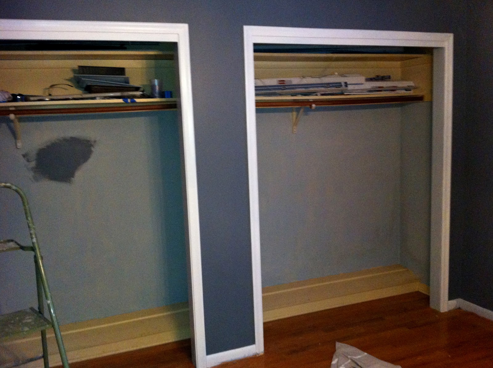
So, I was a little confused as to what it would actually look like because the colors were so different in the two rooms.  However, I loved the way it looked in the first picture, so we decided to take the risk and go for it.  We painted that night and could not be happier.  The color is absolutely lovely, and looks much more like the first photo that I found than the second.  It definitely has some green in it, but not much and is more gray than green.  Tony disagrees and says it is army green...it isn't (in my opinion at least).  Here are a few quick iPhone pictures of the room, color is a little off, but not much:

Inside of closets are currently still baby blue and trim was just sort of painted in these pictures, so it will look better once I actually do it...I just wanted to get an idea of what it would look like.
For now, we are at a stand still.  The floors are being redone and we can't get into the house until Sunday.  After working on the house for Almost a full month (he closed January 13), it feels strange not to go home from work every night and work constantly until 2am or later.  I guess it's good to take a break, though, because my knees are killing me (from painting the baseboard), my wrists are hands and wrists are always sore (from all of the painting, carpet staple removal, etc etc...I could go on and on) and I'm just overall tired...all the time.

We went back and forth on the color he wanted to choose for the floors for a while, but eventually decided on a darker color, but not too dark, with a little red, but not too much red...easy, right? :)

He is using highly recommended, First Pace Flooring, and they have been awesome so far.  On Wednesday, he sent me a sample of the colors while I was at work to confirm that we were on the same page as far as color goes and we both agreed on the same one.

Another cell phone picture...we both liked the far left best.
I believe the color he ended up choosing was English Chestnut that he custom mixed to be slightly darker with a little more red in it.

We will be able to go into the house wearing socks on Sunday.  However, we won't be able to move furniture back into the rooms until Tuesday, and we won't be able to put down carpets for 3 weeks.  I will post pictures as soon as we see the final results :)

-Annie

Read more...

The Entry

The entry is almost finished! We just have a few switch plates to change out and of course furnish it, and then we're good! I'm going to be posting the pictures, but Tony was much more involved in the actual taking down of the wallpaper and refinishing the walls. Without his mad skim coat skills, the walls would seriously look like crap. So, I'll let him explain on the picture captions below...

Entry during the inspection.

Entry during the inspection
Entry on first day of move-in

The wallpaper seemed like it was in pretty good shape and fairly new, so I thought that it wouldn't be too hard to take down. I was wrong. It turned out that the people who put it up had skim coated the wall and then went straight to putting up the wallpaper without properly sizing. So after many hours of peeling small strips of wallpaper with Annie's Mom's magical steam gun, we noticed that the surface of the wall now looked like the surface of the moon. If we would have painted it as-is it would have looked awful, so I decided to skim coat the wall again. I went with a pre-mixed finishing joint compound which turned out to go on fairly easy and sand easy as well. It was still my first time ever skim coating a wall so I did my fair share of sanding. With the exception of a few rough spots around the light switches, the walls came out looking pretty good.
Entry after skim coat added to even out the walls
Entry after skim coat was added to even out the walls

First layer of wall paint (New York State of Mind), no trim paint yet.

As you can see from the caption above Annie keeps referring to this paint as New York State of Mind. Well, that is only 90% correct. We decided that the original New York State of Mind was too dark so we went 10% lighter. By doing this, it is now a new paint color, deserving of it's own name. The paint was named Papa Smurf Blue by the clerk who mixed it at Allied Paints in Topeka.  Annie refuses to acknowledge that he named it this.
(Almost) finished entry. Wall paint and trim paint done.


(Almost) finished entry. Wall paint and trim paint done.
(Almost) finished entry. Wall paint (New York State of Mind) and trim (Mascarpone) finished, still waiting on a few details and of course furniture.
This chandelier was from the previous owner. We cleaned it up a little, and while it is kind of dated and has fake wax dripping from the "candles" (aka light bulbs)...we actually like it and it is staying.
Due to the overwhelming amount of snow that we got yesterday, everything looked blue outside last night. It was the craziest thing. This is a view out the front door window of the blue outside.

Read more...

Paint Revisited

Basically...painting really stresses me out.  Especially when you're using a paint with a ton of pigment that dries really fast.  For the blue in the kitchen, we decided on Benjamin Moore's New York State of Mind.  Because the blue was so dark and rich in color, we knew we needed a really good paint quality, so we went with the Aura Paint, the highest quality paint BM makes.  While it was quite a bit more expensive that just your standard paint, it was absolutely worth every penny.  It was around $60 a gallon, but I can say with total confidence, that had we not purchased the nicer paint it would have taken 4x as much paint to cover that room, and we would have probably spent as much on the cheaper paint because we would have needed more.  The sample can we got of the New York State of Mind was just the stand paint Benjmain Moore has, and when we painted the sample on the wall it took SO many coats to even cover it and it looked kinda "meh."  It was a totally different story with the Aura paint.

The Aura paint covered SO well...the wallpaper that we took down in the kitchen was VERY difficult and we really struggled to remove it.  There were lots of areas on the wall that were noticeably shallower or just deformed because of all of the repairing and sanding we had to do after the wallpaper was down.  The Aura paint covered every imperfection in 1 coat.  Seriously...1 freaking coat.  The only downside was that it dries SO fast (yup,  that's a downside).  I couldn't work quick enough to keep a wet edge, and was struggling to move the ladder to the next area so that I could seamlessly continue the painting without my previous application drying first.  The first coat looked AWESOME, but I ended up doing another coat just because I knew it would make it look even better...and it did.  I didn't take any after pictures when it was all completed, but here are a few "during" pictures from my trusty iPhone...

The kitchen all prepped...wallpaper gone, and cabinet frames cleaned.
First coat of the New York State of Mind done...no trim/cabinet frames painted yet


First coat of the New York State of Mind done...no trim/cabinet frames painted yet...sorry for the terribly pic quality.
Daylight picture of 1 coat of blue and some trim paint done.  This picture is probably the most true to the actual color of the trim and the blue.


The next 3 pictures were all taken late at night with really poor lighting so the color is way off, but they are pictures of 2 coats of the New York State of Mind and I think almost all of the trim and cabinet framing done.  Of course, I still have lots and lots of touchups to do :(


I guess I have a few pictures from my actual camera I took early on in the process of painting the kitchen...

Without internet or cable yet it is kind of hard to stay entertained while painting for hours, so my iPad and streaming Netflix...I think I watched 5 documentaries (seriously).

I kind of like the way the frog tape looks next to the blue :)
There is still a lot of touching up to do in the kitchen, and I'm just kind of stressed out about all of the edges and how they aren't super clean...but I guess that will all come in time...

-Annie

Read more...

Paint

I mentioned paint in the last post, so I figured I would talk about the the color palette we decided on.  It is mostly light colors with a dark blue in some spots (and a few undecideds).  The wall color we decided on for most of the house was a light gray.  When it comes to lighter colors, I will never trust a paint swatch again, because all of the colors looked SO different on the wall than they did on the swatches.  So, after much deliberating we narrowed down the wall color for the living room, formal living room and guest bedrooms (for now) to Benjamin Moore Revere Pewter (a much more beigey gray...greige) and Benjamin Moore Stonington Gray (it looks nothing like the online paint swatch on the link).

After painting both of the samples in a few rooms at the house, Tony decided on the Stonington Gray.  I'm really excited to see what it is going to look like without the pre-existing dark cream walls behind it.  Here is a terrible picture of what they look like in the formal living room:

Mascarpone and Revere Pewter on the Left, Mascarpone and Stonington Gray on the Right
We wanted a white for the trim, but Tony was insistent that he did not want a bright white, so we went with a much warmer white that would warm up the cool gray.  Well, after 2 weeks of debating a white we (okay, my mom) finally found Benjamin Moore's Mascarpone (doesn't really look like that online swatch either...)  We love the Mascarpone, and so far it looks great on the cabinets.

The blue is going to be in the front entry, on the backs of the bookcase and above the wainscoting in the kitchen...I really wanted a rich blue that was closer to a jewel tone, but not purple.  I didn't want Navy, but I wanted the color to be closer to a Navy than a true blue if that makes any sense at all.  So, after narrowing it down to Lucerne and New York State of Mind (both Benjamin Moore).  After getting samples of each and actually seeing them on the wall, we decided on New York State of Mind hands down.  Lucerne was much too green/teal and not exactly what we wanted.  New York State of Mind looks nothing like the online paint swatch, so I'll try and take a picture of the paint sample on the wall today...

The final color that we have picked out is for the full bath in the hallway.  The majority of the bathroom is tiled with white tiles as you can see here:


There are also a few cute accent tiles around the vanity area that have blues, greens, yellows and I think the dark color is purple.


So, I really wanted to do a wall color in here that pulled form the accent tiles, because even though I believe they are original from when the house was built in 1962, I think they are very charming and I don't mind them at all.  So, the obvious choice for me was green.  One of my favorite colors is what I like to call: Kate Spade Green.  I've always liked the color green, but my obsession with "Kate Spade Green" began when I received this wallet as a birthday present 4 or 5 years ago:

Yes, it needs to be cleaned badly...but I love it just the same.
Tony also likes the color, so we decided to look for a paint color to match the wallet for the guest full bath.  We also wanted to save a little money on this paint, so instead of getting Benjamin Moore, we were open to doing something from Home Depot or Lowes.  While at Home Depot, buying kitchen hardware (a whole other story) Tony spotted Martha Stewart's Bay Leaf.  The swatch looked just about perfect, so we purchased the little 8oz sample to try it out.  After painting a small patch on the wall we love it and are going to go with this color for the guest bath.  So happy to have figured that out so easily.

In person it is a tiny bit darker than this, but this is pretty spot on as far as tint goes.

Read more...

Walk Through Pictures

A little bit about Tony's house...

We think that the house is perfect, and honestly more than I expected we'd get for his price range.  It is a 1620 sq ft house in a good, established neighborhood with easy access to the highway.  It has 3 bedrooms that are all good sized, and 2 full bathrooms.  

Now begins the fun (and very expensive) task of furnishing and decorating a first home.  I have so many ideas, and I'm kind of struggling with execution.  My inspiration folder on my computer is growing by the hour, while my wallet unfortunately isn't.  Luckily, I (I'm not going to let him take credit for this, because he was reluctant about moving so fast) was smart enough to start picking out paint colors and decide the general color palette as soon as his offer was accepted.  This has helped tremendously, because we were able to purchase all of the paint and get to work right away.  If we would have started the process of choosing paint colors after he closed, we wouldn't have been able to get anything done for weeks, because who knew that there were so many shades of white and that they could all be so different.

On that note, here are a few pictures I was able to snap of the house during the inspection.  Ignore all of the wandering people (family).  I had to be quick, because I was getting in the way of the inspector a bit, so they aren't the best, but I think you get the idea.

I have some newer ones without people and the previous owner's furniture that I took on closing day, but honestly I'm just too lazy to upload those right now.


I love the nice big corner lot.

Entry

Marble floor entry

Front room will likely be used as the living room.


This is the formal living room that you see straight ahead of you as you first enter the house.  I love the fireplace and built in book cases.

One of my favorite parts of the house.

Kitchen


This angle shows you a little more of the bay window area/breakfast nook.

Hallway to the bedrooms.

Guest Bedroom #1/Office: There are hardwoods under all of the carpet that we are going to pull up and refinish.

Other side of guest bedroom #1/office

Guest bedroom #2.

Full bath #1

Master Bedroom

Another angle of the master.  Door to the master bathroom is to the left of where I was standing when I took this picture.

Master bath...a little small, but it works.

Master bath

Master bath

Love the patio on the back of the house.


A little more of the patio

And more patio.

And more patio...and Tony.  Yes, he's wearing short sleeves...it was actually a fairly nice December day...just not short sleeve weather.

2 car garage on the side of the house, which we both love (both the fact that it's hidden, and that it has room for 2 cars...something that was hard to find in this area in his price range)

Read more...

  © Blogger template Shush by Ourblogtemplates.com 2009

Back to TOP