The Bookcase Part 2

If you missed the first post, cleverly titled: The Bookcase Part 1 you might want to read that first before reading this post. :)

So, we had some red objects and a few silver ones in the bookcase with blue backs.  I liked it, but I showed my mom and she thought we needed a little more variation in color.  Yellow seemed like the obvious go-to, because it was the accent color being used in the kitchen with the blue walls.

I wasn't really sure what the yellow was going to be until I stumbled across a craigslist posting that caught my eye.  I'm not even really sure what section I was looking in, or how I saw it, but I found a man on craigslist selling over 300 National Geographic Magazines for $60 (plus a nice bookcase to go with).  The oldest magazine was from 1956, and include almost every issue from 1960-2003.  I did a quick google/ebay search and found that half as many National Geographics from the same period were selling for $300+ on ebay.  Plus, I love history very much, and I love looking through National Geographics very much, so if it ended up not working out in the bookcase, I figured they would not go to waste.

I was a little nervous, because it was my first craigslist purchase and the man asked to meet in the parking lot of a grocery store in Lawrence by a flag pole and to look for his van...oh, and he said he didn't own a cell phone.  So, naturally I call my mom and ask if she will go with me, and she was awesome and said yes.  So, we both show up at the flag pole and find our van.  Turns out, it was an incredibly nice man who had separated out the magazines into smaller boxes so they would be easier to carry.  He even gave me a whole box of Smithsonian magazines for free.  All in all, it was a great experience, but I'm still glad I had my mom there with me :)

I took them back to Tony's house and started going through them, and was in love.  I couldn't stop looking at all of the old advertisements and articles.  It was all so fascinating.


Eventually I found the issue form March 1987 (the month/year I was born) and lots of other neat issues like right after we landed on the moon.

Love that they had the floral border in the 60's and 70's
Landing on the Moon
Hologram Edition from 1989 I believe
The famous piercing eyes issue.
Issue from the month I was born.
My oldest issue, February 1956
So, then it was just a matter of putting them in the bookcase in a way that wasn't too contrived, and that added something to the room. Which was much more difficult than it sounds.  Eventually, I came up with this:


This set up is definitely not permanent.  It seems a little contrived, and the primary colors thing is a little bit in your face.  I like it, I think I love it, but I'm just not sure.  Tony likes it, which is the most important thing.  The only thing that bugs me is when people assume we went red blue and yellow because they are KU colors.  That honestly wasn't the intention at all.  And this blue is definitely not PMS293 KU blue (at least not in person).  Working with that color all day, I'm not sure I could look at it all night too :)  However, I guess I understand where people get that idea (even the Crate and Barrel movers immediately said, Oh I get it, KU color scheme)...so I should just let it go and move on.  It's not like it's a bad thing.

The set up isn't permanent, who knows, I'm sure it will all move around before too long and once Tony starts getting actual objects in the house, it will hopefully feel less placed and more personal.  I didn't purchase any object that didn't have a personal connection or meaning to one of us, but it's always nice to have actual personal objects as well.  Here are a few details from the bookcase:

p.s. ignore all of the empty picture frames with random models in them.  Those will be filled at some point...hopefully.

iPhone picture...sorry


An airplane for Tony :)


As always, love my sailboats :)

I just love this little birdie!


Right side
Left side

Read more...

The Bookcase (Part 1)

(This post has been sitting in my drafts for probably 2 weeks now.  I just haven't had time to finish it, so I figure I might as well post half of it.  Here's the first part...second part to come later.)

The bookcase in the den was one of the first things I loved about the house.  Right when you walk in the front door, you walk straight ahead and see a large built in bookcase and a lovely fireplace.  This is what it looked like when we first walked through the house:

Picture is a screen shot from the listing
And here is what it looked like on closing day:


We decided to carry over the blue from the kitchen (BM New York State of Mind -10%), but only on the backs of the bookcases.  So, that was the first step...

This is from one of the first few days in the house, and if you can't tell, the den was the central spot for all tools or really just anything.  Looking at this stresses me out beyond belief...I am so thankful it is gone!
Once that was done, we added back in the shelves, painted the cabinet doors, added new hardware to the doors and I started adding things to it.  I wanted to only use a few different colors in the bookcase, and that color ended up being red.  I initially (before Tony had even closed on the house) gone to a used book store and purchased about $60 worth of used red books.  I didn't want them to be just any books, because no one wants random books in their bookcase.  My concentration in college was in Art History, and I have always loved everything about it.  It just so happens, most of the Art History books were red, so I lucked out.  I also got a few architectural/engineering books for Tony and even a Catholic hymnal book to remind him of his days in Catholic school :)  Little did I know, that it was the exact same hymnal he used in elementary school.

So, once I had the books, I slowly started adding random pieces I found.  I first picked up a few from Hobby Lobby, and realized how much stuff it was going to take to make the bookcase look full.


A few more items added, and Tony painting the ceiling.  Not the color of the ceilings before in contrast with them now...makes the room feel so different

Then, one day Tony convinced me to go to a little shop in Overland Park called Great Finds.  Now, admittedly I was hesitant, but went with an open mind.  It was SO much better than I expected.  Great used furniture at even better prices.  While we didn't find any furniture, we did find a painting that we both loved.  While it is a little small, it will do for now.  I believe it was marked at $60 and we got it for 1/2 off.  We ended up paying $30 for a very pretty original oil painting.  The canvas is a little loose, but not too bad.  The frame is even a great blue color which made us love it even more...oh, and it has sailboats...which means I obviously love it.

Sorry...iPhone close-up
I think that's enough pictures for one post.  I will finish the "bookcase post" later on...

Read more...

Just Some Random Updates

Just a few random iPhone pictures for now. The light fixture for the kitchen arrived and Tony installed it Friday. Yesterday, the couch and garnet cabinet from Crate and Barrel were delivered. Still have lots of work to do in the den, but it's coming together! Once I have some free time I will post better pictures with more info, but this will do for now :) Happy Sunday!

-Annie

P.S. We don't plan on leaving the tv tray as a side table :) Or the little rugs we used to add felt to the bottom of the sofa.

Read more...

The Floors

I'm sitting here at the Toyota dealership waiting for my oil to be changed, and figured it was a good time to (finally) update the blog :)

No recent updates, because things have been at a bit of a stand still while the floors were being refinished.  The smell is finally going away, and thanks to some 70 degree days (yup, and it was in the negatives last week) Tony has been able to keep the windows and doors open to air out the house a bit.  The floors are beautiful and they did a really excellent job on them.  The color is exactly what Tony wanted, and even though he was a little apprehensive about spending so much money redoing floors that were in good shape, I think he doesn't regret it at all.  It makes everything look more updated and more uniform (there were a few different colors of hardwoods before they were refinished).

Unfortunately, I haven't been at the house during daylight since the floors were refinished...lots of very long work days and photo-shoots.  So, I haven't had time to get any good pictures of the floors, so all I have are a couple of quick iPhone pictures I snapped that will have to do for now.

Here are the kitchen floors before:


And after... (again...terrible quality iPhone picture with poor lighting)

This photo makes them look a bit darker than they actually are, but it is close.

Den before and after:


The rest are just a few random pictures of the floors from my iPhone...

Guest Bedroom
Master Bedroom
Hallway standing at the entry of the full guest bath.  Ignore the very dirty bathroom floor...we were doing lots of wallpaper removal and other fun stuff in there and it really needs to be cleaned up!
Breakfast Nook in the Kitchen
Maybe I will have some free time soon and will be able to take some better pictures that are more true to color :)

Read more...

Master Bedroom Walls and Refinishing the Floors

So, I have lots of picture updates but not much time, so I thought I would quickly show the color we ended up picking for the master bedroom.  For some reason, we just couldn't find something we loved for the master, and it is the only paint color we hadn't picked out as of this past Monday.  We wanted something to go with our gray(ish) color palette, but we wanted it to be different and darker than the lighter walls in the rest of the house.  We just kept going back and forth...not really sure if we wanted all of the walls the same color, or maybe do one wall dark and the rest light...we have kind of just been all over the place with this decision.

We played around with these three colors:

All colors are Benjamin Moore.  Top is Alexandria Beige, bottom right is Kingsport Gray and the bottom left is Manchester Tan

We weren't a fan of any of them, and so it was back to where we started...having no idea what to choose.

Then, this past weekend reality struck and we realized we needed to paint the Master before they started redoing the hardwoods.  We just didn't want to deal with having to do any major painting (other than trim) after spending lots of money to redo the hardwoods in the whole house.  Hardwood refinishing began Wednesday morning at 9am, so we were on a tight schedule.

After finding nothing we both liked over the weekend, we had kind of given up and given in to the fact that we might be painting the walls after the floors were refinished, which wasn't ideal but would work out just fine in the end.  Then, at work on Monday, I received a text message from Tony telling me to look at Duxbury Gray.  I did a very quick google search where I found this:

From: http://katieandchriscoleman.blogspot.com
and this:

From here: http://ths.gardenweb.com/forums/load/decor/gal0111342625932.html
So, I was a little confused as to what it would actually look like because the colors were so different in the two rooms.  However, I loved the way it looked in the first picture, so we decided to take the risk and go for it.  We painted that night and could not be happier.  The color is absolutely lovely, and looks much more like the first photo that I found than the second.  It definitely has some green in it, but not much and is more gray than green.  Tony disagrees and says it is army green...it isn't (in my opinion at least).  Here are a few quick iPhone pictures of the room, color is a little off, but not much:

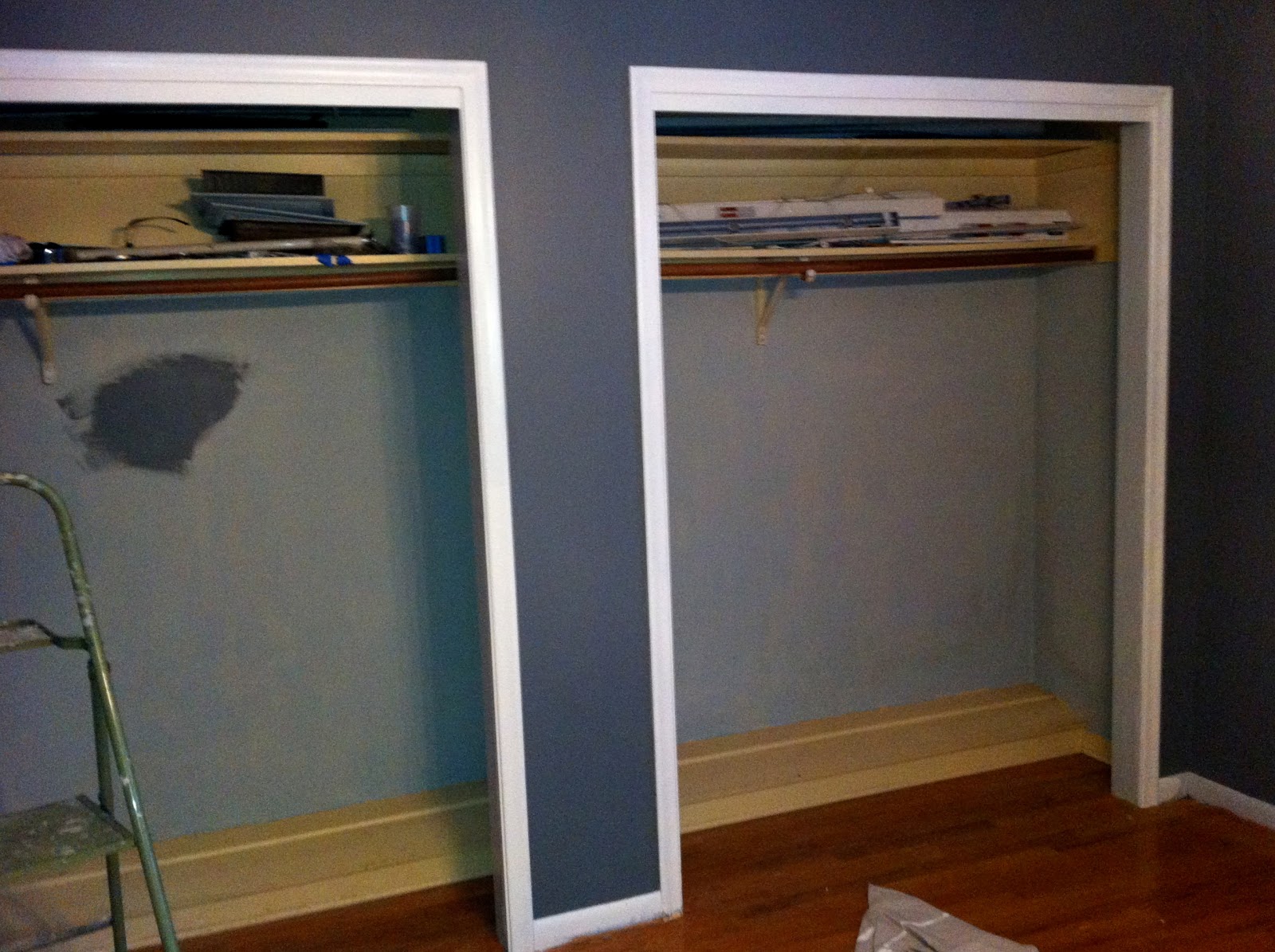
Inside of closets are currently still baby blue and trim was just sort of painted in these pictures, so it will look better once I actually do it...I just wanted to get an idea of what it would look like.
For now, we are at a stand still.  The floors are being redone and we can't get into the house until Sunday.  After working on the house for Almost a full month (he closed January 13), it feels strange not to go home from work every night and work constantly until 2am or later.  I guess it's good to take a break, though, because my knees are killing me (from painting the baseboard), my wrists are hands and wrists are always sore (from all of the painting, carpet staple removal, etc etc...I could go on and on) and I'm just overall tired...all the time.

We went back and forth on the color he wanted to choose for the floors for a while, but eventually decided on a darker color, but not too dark, with a little red, but not too much red...easy, right? :)

He is using highly recommended, First Pace Flooring, and they have been awesome so far.  On Wednesday, he sent me a sample of the colors while I was at work to confirm that we were on the same page as far as color goes and we both agreed on the same one.

Another cell phone picture...we both liked the far left best.
I believe the color he ended up choosing was English Chestnut that he custom mixed to be slightly darker with a little more red in it.

We will be able to go into the house wearing socks on Sunday.  However, we won't be able to move furniture back into the rooms until Tuesday, and we won't be able to put down carpets for 3 weeks.  I will post pictures as soon as we see the final results :)

-Annie

Read more...

The Entry

The entry is almost finished! We just have a few switch plates to change out and of course furnish it, and then we're good! I'm going to be posting the pictures, but Tony was much more involved in the actual taking down of the wallpaper and refinishing the walls. Without his mad skim coat skills, the walls would seriously look like crap. So, I'll let him explain on the picture captions below...

Entry during the inspection.

Entry during the inspection
Entry on first day of move-in

The wallpaper seemed like it was in pretty good shape and fairly new, so I thought that it wouldn't be too hard to take down. I was wrong. It turned out that the people who put it up had skim coated the wall and then went straight to putting up the wallpaper without properly sizing. So after many hours of peeling small strips of wallpaper with Annie's Mom's magical steam gun, we noticed that the surface of the wall now looked like the surface of the moon. If we would have painted it as-is it would have looked awful, so I decided to skim coat the wall again. I went with a pre-mixed finishing joint compound which turned out to go on fairly easy and sand easy as well. It was still my first time ever skim coating a wall so I did my fair share of sanding. With the exception of a few rough spots around the light switches, the walls came out looking pretty good.
Entry after skim coat added to even out the walls
Entry after skim coat was added to even out the walls

First layer of wall paint (New York State of Mind), no trim paint yet.

As you can see from the caption above Annie keeps referring to this paint as New York State of Mind. Well, that is only 90% correct. We decided that the original New York State of Mind was too dark so we went 10% lighter. By doing this, it is now a new paint color, deserving of it's own name. The paint was named Papa Smurf Blue by the clerk who mixed it at Allied Paints in Topeka.  Annie refuses to acknowledge that he named it this.
(Almost) finished entry. Wall paint and trim paint done.


(Almost) finished entry. Wall paint and trim paint done.
(Almost) finished entry. Wall paint (New York State of Mind) and trim (Mascarpone) finished, still waiting on a few details and of course furniture.
This chandelier was from the previous owner. We cleaned it up a little, and while it is kind of dated and has fake wax dripping from the "candles" (aka light bulbs)...we actually like it and it is staying.
Due to the overwhelming amount of snow that we got yesterday, everything looked blue outside last night. It was the craziest thing. This is a view out the front door window of the blue outside.

Read more...

  © Blogger template Shush by Ourblogtemplates.com 2009

Back to TOP