Paint
>> Monday, January 17, 2011 –
decorating,
home,
paint
I mentioned paint in the last post, so I figured I would talk about the the color palette we decided on. It is mostly light colors with a dark blue in some spots (and a few undecideds). The wall color we decided on for most of the house was a light gray. When it comes to lighter colors, I will never trust a paint swatch again, because all of the colors looked SO different on the wall than they did on the swatches. So, after much deliberating we narrowed down the wall color for the living room, formal living room and guest bedrooms (for now) to Benjamin Moore Revere Pewter (a much more beigey gray...greige) and Benjamin Moore Stonington Gray (it looks nothing like the online paint swatch on the link).
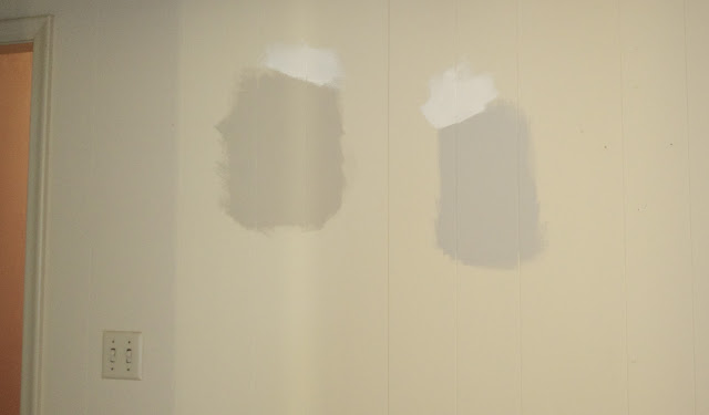
After painting both of the samples in a few rooms at the house, Tony decided on the Stonington Gray. I'm really excited to see what it is going to look like without the pre-existing dark cream walls behind it. Here is a terrible picture of what they look like in the formal living room:
We wanted a white for the trim, but Tony was insistent that he did not want a bright white, so we went with a much warmer white that would warm up the cool gray. Well, after 2 weeks of debating a white we (okay, my mom) finally found Benjamin Moore's Mascarpone (doesn't really look like that online swatch either...) We love the Mascarpone, and so far it looks great on the cabinets.
After painting both of the samples in a few rooms at the house, Tony decided on the Stonington Gray. I'm really excited to see what it is going to look like without the pre-existing dark cream walls behind it. Here is a terrible picture of what they look like in the formal living room:
 |
| Mascarpone and Revere Pewter on the Left, Mascarpone and Stonington Gray on the Right |
The blue is going to be in the front entry, on the backs of the bookcase and above the wainscoting in the kitchen...I really wanted a rich blue that was closer to a jewel tone, but not purple. I didn't want Navy, but I wanted the color to be closer to a Navy than a true blue if that makes any sense at all. So, after narrowing it down to Lucerne and New York State of Mind (both Benjamin Moore). After getting samples of each and actually seeing them on the wall, we decided on New York State of Mind hands down. Lucerne was much too green/teal and not exactly what we wanted. New York State of Mind looks nothing like the online paint swatch, so I'll try and take a picture of the paint sample on the wall today...
The final color that we have picked out is for the full bath in the hallway. The majority of the bathroom is tiled with white tiles as you can see here:
There are also a few cute accent tiles around the vanity area that have blues, greens, yellows and I think the dark color is purple.
The final color that we have picked out is for the full bath in the hallway. The majority of the bathroom is tiled with white tiles as you can see here:
There are also a few cute accent tiles around the vanity area that have blues, greens, yellows and I think the dark color is purple.
So, I really wanted to do a wall color in here that pulled form the accent tiles, because even though I believe they are original from when the house was built in 1962, I think they are very charming and I don't mind them at all. So, the obvious choice for me was green. One of my favorite colors is what I like to call: Kate Spade Green. I've always liked the color green, but my obsession with "Kate Spade Green" began when I received this wallet as a birthday present 4 or 5 years ago:
Tony also likes the color, so we decided to look for a paint color to match the wallet for the guest full bath. We also wanted to save a little money on this paint, so instead of getting Benjamin Moore, we were open to doing something from Home Depot or Lowes. While at Home Depot, buying kitchen hardware (a whole other story) Tony spotted Martha Stewart's Bay Leaf. The swatch looked just about perfect, so we purchased the little 8oz sample to try it out. After painting a small patch on the wall we love it and are going to go with this color for the guest bath. So happy to have figured that out so easily.
 |
| Yes, it needs to be cleaned badly...but I love it just the same. |
 |
| In person it is a tiny bit darker than this, but this is pretty spot on as far as tint goes. |


